
This sticks to the "original" colours. Of course that isn't strictly necessary, so I then applied a few gradient fills and fractal pattern fills:
|\/|                     Some Text Centred                       |\/|
|  |~~~~~~~~~~~~~~~~~~~~~~~~~~~~~~~~~~~~~~~~~~~~~~~~~~~~~~~~~~~~~|  |
where the |\/|s (on ANSI colour terminals) are white on blue squares, the centred text is cyan, and the squiggly line is blue. Obviously without the restrictions of sticking to the ASCII character set you can embellish, so this is what I've come up with so far.
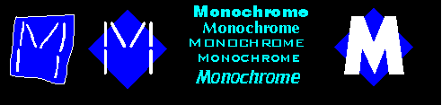
This sticks to the "original" colours. Of course that isn't strictly
necessary, so I then applied a few gradient fills and fractal pattern
fills:

I put a pattern fill on the text just to be different (ie not a
gradient fill). It was chosen pretty hastily -- remember these are
just sketches -- and will probably look much better if I take the
time to choose and sculpt a good one.
Finally, here's a few more bits and pieces. Choosing a font is never
easy; I selected a nice thick swiss originally because that's what
I used for the small mention of Mono on one of my earlier
t-shirts,
but there are plenty of alternatives upto and including designing a
custom one.
The other logoey type thing that Mono needs is a new logo for the opening screen. The current one is old and doesn't look impressive "by today's Ascii-art standards"... for example, Surfers has a really cool logo, but is a really sad site; we need a cooler one. Ascii-art has never been my strongpoint, but I had in mind something like this...
.    .   .  . ..___________________________________________________________
.    .   .  . .._###################_______________________________________
.    .   .  . .._##  # ####### #  ##_  M  O  N  O  C  H  R  O  M  E  (TM)
.    .   .  . .._##  #  #####  #  ##_______________________________________
.    .   .  . .._##  ##  ###  ##  ##_____Europe's Biggest Internet BBS_____
.    .   .  . .._##  ###  #  ###  ##_______________________________________
.    .   .  . .._###################_______________________________________
.    .   .  . .._##  ###########  ##_______________________________________
.    .   .  . .._##  ###########  ##____software and administration by_____
.    .   .  . .._##  ###########  ##___________David K Brownlee____________
.    .   .  . .._##  ###########  ##_______________________________________
.    .   .  . .._###################_______________________________________
.    .   .  . ..___________________________________________________________
or this, but it would need to be a lot tidier...
  ____   ____     ________     _______   _  ______     ____   ____
 / __ \ / __ \   / ______ \   / ______| | |/ _____|   / __ \ / __ \
| /  \ V /  \_|_| /      \_|_/ /\  | |  |   /    ____|_/  \ V /  \ |____
| |   | |  / ___| |\    / __| |\ \ | | _|  /    / _____ \  | |  /| |___ \
| |   | | / / | | | \  / / | \ \| ||_|/ | | \  / /   | \ \ | | / | |___\ \
| |   | || || | |_|| || ||_|  \_| |___|/|_|\ || |    |_|| ||_||  |_|______|
| |   | | \ | |___/ /  \ \_____/ / |  /    | | \ \_____/ /     \ \_ ______
|_|   |_|  \|_|____/    \_______/  |_|     |_|  \_______/       \_________|
Or there's always a simple figlet version...
 __  __                        _
|  \/  |                      | |
| \  / | ___  _ __   ___   ___| |__  _ __ ___  _ __ ___   ___
| |\/| |/ _ \| '_ \ / _ \ / __| '_ \| '__/ _ \| '_ ` _ \ / _ \
| |  | | (_) | | | | (_) | (__| | | | | | (_) | | | | | |  __/
|_|  |_|\___/|_| |_|\___/ \___|_| |_|_|  \___/|_| |_| |_|\___|